
London 2012 Olympic Branding: No More Gradients
Preamble
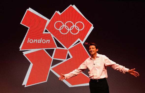
I'm reasonably interested in the Olympic games rapidly approaching this summer. I still remember the excitement cum impatience I felt upon first hearing we'd [obnoxiously proud Brit speaking here] won the games bid. 2012 seemed a lifetime at that moment. But it's here now.
As such, we're beginning to see more and more promotional material released into the public domain e.g logo, mascots, advertisements and such. As a marketeer and graphic designer, the saga of London 2012's logo has most definitely caught my attention.
The logo has been called ugly, phallic, seizure inducing, too edgy, too try hard and a myriad of other things. But i'd like to take this opportunity to stage a rebuttal.
It's Not Boring
Subheading is suitable for both these paragraphs and the subject as a whole
The bright colours and distinctive design of the logo definitely do stand from out it's cliche ridden peers. It's both memorable and recognizable. Can anyone draw the Beijing Olympic logo from memory? Or the logo prior? Didn't think so.
Apathetic designers and marketers are continually attacking the monotony of the status-quo; London breaks the mould.
It's Different
The London logo avoids all the obvious/facepalm pitfalls of current logo design. No brushstrokes. No feathered drop shadows. No mirrored reflections. No gradients. No patriotic colours. No rainbows, ribbons, landmarks, symbols of unity, maps, swooshes or globes. It's different.
It's Reproducible
Vitally important for an Olympic logo given the variety of media forms it needs to appear upon e.g application forms, receipts, tickets, televisions, websites, posters etc.
Aside from the kerning and x-width of "London" inflating when sloppily rendered for the web (most notably the initial BBC reproduction that ended up on all websites critiquing the logo), it's good to see a logo that's so easily printable, broadcastable, embroiderable and moldable.
Think of how horrible this Chicago Olympic logo conceptwould look when it's process-printed-from-a-register with a 100 line screen on a McDonalds cup. The London logo works both in colour and B&W.
It's Flexible
The logo is available in a variety of colour combinations, shapes and patterns, keeping the logo fresh upon each viewing but coherently consistent. This is a godsend for corporate partners needing to incorporate London branding within their own.
It's Simple
"I could have drawn that/done better" is a common insult of the London logo. Ignoring the fact that genius/creativity are required for creation not reproduction, some of the greatest logos of all time involve merely two to four lines (Christian cross, Mercedes etc.).
Its The Basis For A Graphic System
Hallmark/Mega-Events such as the Olympics require masses of signage, identification, oranmentation and architectue (both permanent and temporary). The London logo and it's associated colours, shapes, type and patterns are the perfect foundation for some fantastic signage, event icons, banners, tickets, uniforms and merchandising etc. You can say goodbye to Union Jack bric-a-brac.
Its Timeless
Complaints about the sources of inspiration of the logo range from "Never Mind the Bollocks" to Tangrams to 80's new wave to MTV. Some said it's "too current" and would look dated by 2012. Others say it's too futuristic or modern.
But in truth, all design is influenced by previous design. This design manages to rise above it's influence, yet remains simple enough to stand on its own.
It's British
By far the most prominent names within British design are Neville Brody and Peter Saville. Without being a direct reguritation, the 2012 logo is evocative of their work and everything great about the United Kingdom.
-Rant Ends-
What are your thoughts on the London Olympic logo?
PsyhcoWalrus
It's alright. It looks kind of tacky though, more like a an art project gone wrong or some graffiti. Is red and white London's colours? Or is that just what they chose?
WaterShake
Logo comes in a huge variety of different colour schemes (e.g pink & yellow, teal & orange etc.), red & white is just one of the many variations.
Haven't a clue what the inspiration behind the colour choices were.